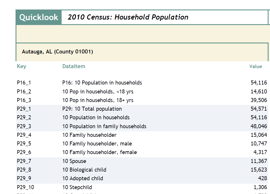
Quicklook Tour
When you choose "Quicklook.." from the Scan/US data menu, you open a dialog you can use to examine and compare demographic data. You can print reports, export data to Excel, as well as create and save benchmark data for future use. To get started, first make sure you are in Select mode:
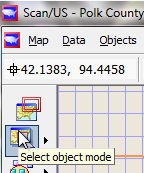
Select object mode
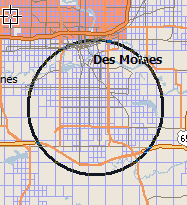
Click in the US map just east of Omaha, and select Pottawattamie County, Iowa.
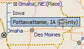
Pottawattamie, Iowa
Then, from the Data menu, choose Quicklook..
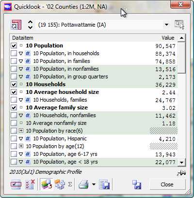
Quicklook dialog
Demographic data is shown for Pottawattamie County. Another way to bring up Quicklook is to right-click on the map, and choose Quicklook from the context menu:
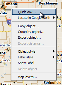
Context Menu: Quicklook
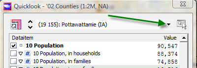
Starting with the selected area dropdown, now showing the phrase "(19 155): Pottawattamie (IA)", we are going to proceed clockwise around the Quicklook dialog, explaining each control. When necessary, we will develop other contexts in Scan/US, going step by step so you can follow along.
Quicklook Object Dropdown
The object selection dropdown (green arrow) gives you a list of all the objects on the current layer.
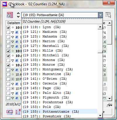
QL Object dropdown: expanded
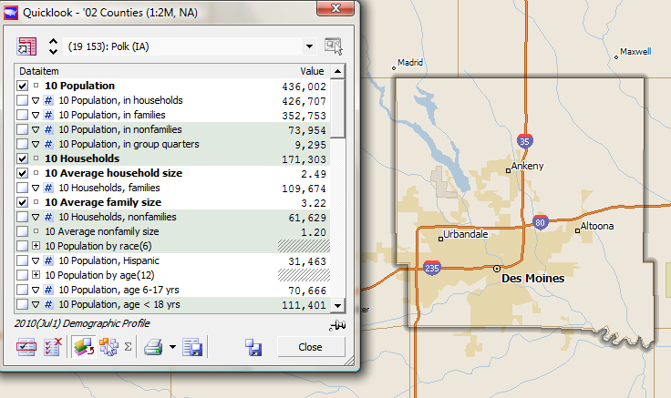
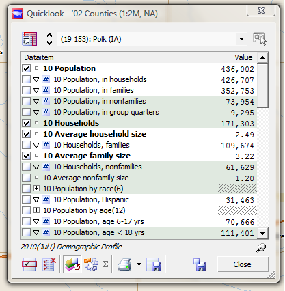
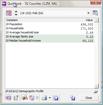
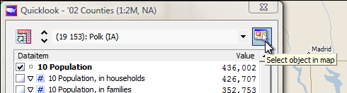
This shows all the counties, presented in FIPS code order, which is also alphabetical order. The FIPS code for Iowa is 19, and the county code for Pottawattamie is 155. Select Polk county, and the demographic values for Polk will be presented in Quicklook:
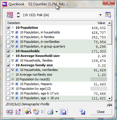
Demographic Values for object
The up-down marks to the left of the county name will step through the counties one by one, and you can use the button the right of the object name to select the current object in the map.
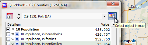
Select object in map
When an object is selected in the map, zooming in to the map will zoom in directly on that object! Using the Zoom Slider at the left, do this with your new selection of Polk county:
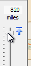
Zoom slider
After zooming in, you can see the county boundaries highlighted, showing Des Moines in the center of Polk County.
Highlighed object after 'Select object in map'
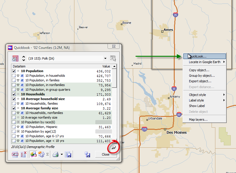
Now, you can "freeze" Quicklook on Polk county (and on the county layer) if you click the pushpin just above the "Close" button (red circle below). Right-click the map to bring up the context menu and choose Quicklook again, to bring up a second Quicklook.
Pinned object in Quicklook
Make sure Scan/US is in select mode, ready to select a different county.
Select mode
When you click on Story County, directly to the north of Polk County, your Quicklooks will look like this:
Quicklook number 1
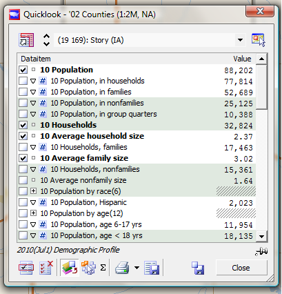
Quicklook number 2
This is one of the ways you can use Quicklook to compare two objects. You will see another one in a few minutes.
Comparing to a Benchmark
To save Polk County, Iowa as a named benchmark that you can compare with later, click the picture of a floppy disk to the left of the close button. Computers no longer use floppy disks at all, but the picture of the floppy still indicates "save" because everyone knows what it means.
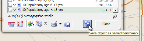
Save object as benchmark
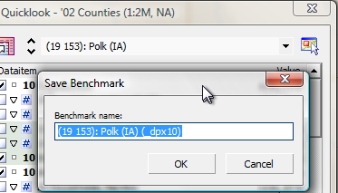
The "Save Benchmark" dialog appears, showing the FIPS county code of the object, the name of the county, and in parentheses, the datalist "_dpx10" that is associated with the benchmark.
"Save Benchmark" Box
Now, in order to use the benchmark more easily, change the name to one you will remember better the next time you see it, before you press "OK":
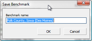
Rename the benchmark!
The benchmark name you type in will be presented in a list of county benchmarks when you open up "compare to benchmarks" later on. Here, we added "Des Moines" to the benchmark name, in case we want to be reminded that Des Moines is in Polk County. The next button in our clockwise tour of Quicklook exports the data about Polk County, Iowa to an Excel Spreadsheet. Go ahead and click it.
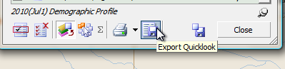
Export Quicklook
What comes up is a link to the file, and an OK button. If you click the link, you will see the exported file opened up in Microsoft Excel.
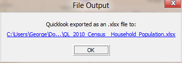
File output showing clickable blue link
For Polk County in 2010, it looks like this:
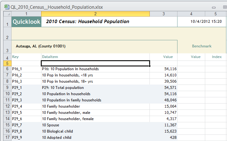
Excel output from Scan/US Quicklook
Even though this is an Excel spreadsheet, it is still formatted to look nice. When you compare an object or a group to a Benchmark, the columns underneath Benchmark on the right will be filled in. The Key names in the left column are used by ScanUS internally to indicate which variable in the database is specified, since many names are similar, this permits us to communicate without confusion when necessary. By the way, the the title of the 2010 Demographic Profile indicates that the data comes from the 2010 Census. Another possible source would be the Scan/US demographic update. Now, skipping over a couple of buttons to the button in the lower left, perhaps you remember there were some data items checked off in Quicklook. If you don't have data items checked, you should check them yourself, otherwise the next part of this exercise won't make sense.
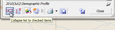
"Collapse List" button at bottom of Quicklook
The leftmost button at the bottom of Quicklook lets you collapse the list to show only the checked items.
Quicklook collapsed, showing only checked variables
The picture above shows how Quicklook looks when it's collapsed to show five data items:
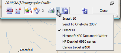
If you want to Export just these five items, collapse the list first, then hit the "Export Quicklook" button. The same goes for printing: only the collapsed-to variables will be printed. The tiny black triangle between the "Export Quicklook" button and the "Print Quicklook" button can be used to set your current printer. Shown below are the printers available on the computer used to create this tutorial. Two are actual physical printers, while the other four mimic physical printers in various ways. The current printer is set to "PrimoPDF", a PDF output program that is available for free download.
Setting the current printer from Quicklook
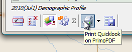
Clicking the "Print Quicklook" button with the current printer set to PDF output will produce a PDF file of the current Quicklook page. Notice that we have "un-clicked" the "collapse list to checked items" button - in its pushed-in form it is called "show all dataitems"
Print to current printer (Primo PDF)
Clicking the print button makes PrimoPDF create a PDF file.
Quicklook print to PDF output
Switching from "Show objects on layer" to "Show Groups" in Quicklook So far we have been using Quicklook to look at just one object at a time (or opening a second Quicklook).
Show (single selected) object on layer
By selecting the adjacent button to the right, "Show groups" (red circle below) Quicklook can also be used to show a group summary.
Show group summary button
Before you can show a group summary, you need to have a group. We will leave counties behind, and make a couple of MicroGrid groups in the Des Moines area. First, using Quicklook, select Polk County in the map.
Select object in map
From the Map Menu, choose New study area..
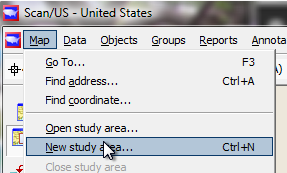
New study area..
Give the new study area a descriptive name you will remember:
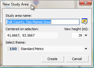
New Study Area name
Right-click the map to bring up Map Layers, and put a check in the box next to MicroGrids. You will make two groups based on MicroGrids and compare them. (Note: your MicroGrid layer will say '12 MicroGrids, or whatever the current year is)
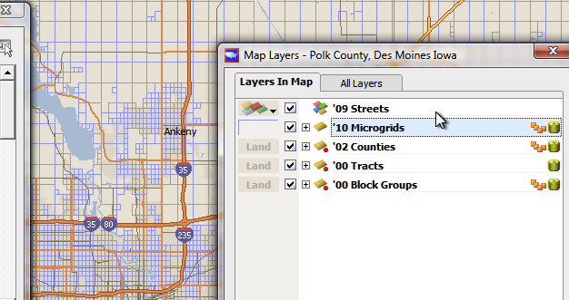
Put a check next to MicroGrids to make sure they appear in the map
Before you continue, remember that the Quicklook is pinned to Counties - that is why Polk(IA) is still showing even though you just added MicroGrids to the map. Click the Pinned icon
 in Quicklook and change it to

Quicklook is not pinned open
, which actually may cause Quicklook to disappear. You can bring it back at any time by selecting Quicklook from the Scan/US Data menu.
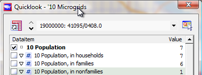
When you bring Quicklook up again, notice that a very small number of people is shown for the selected Microgrid, and that the Microgrid Key is in the object selector. Normally you will not work one grid at a time like this, but if you get curious, you can definitely examine the data for each grid.
Data for one grid
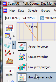
From the mode buttons on the left side, notice there is a menu next to the grouping mode, called "Choose grouping mode":
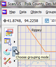
'Choose grouping mode' menu
Click the menu to expand it, and choose "Group by rectangle." Now, any rectangle you draw will group '10 Microgrids into a group, within a grouping. You will have the opportunity to name both group and grouping.
Group by rectangle
Draw the rectangle so it covers the grids contained within the freeway "loop" - actually for the purpose of this example it doesn't matter exactly where.
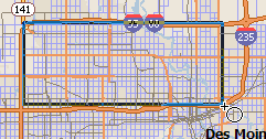
Drawing 'group by' rectangle
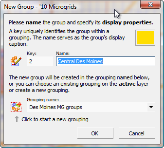
When you stop dragging the rectangle, the New Group dialog appears. You will name the group and grouping.
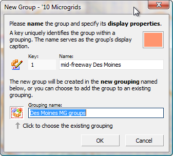
New Group Box, naming the grouping
After you create the group, which will be colored in "salmon", the default color of the first group, notice that the name of the group appears in the Quicklook (top green arrow) and that the "Show groups" button is selected (bottom green arrow). This lets you toggle back and forth between single-object mode and group mode, and select other groups to compare. Let's make another group!
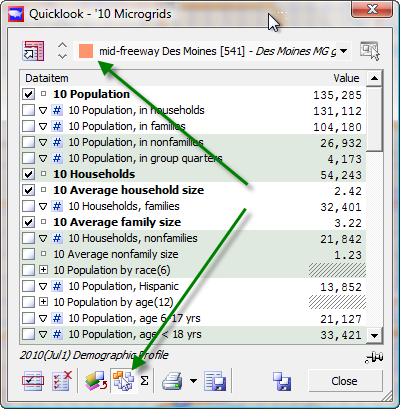
Quicklook group mode
If you draw another rectangle, it will add more grids to the existing group. To start a new group, choose "New Group" from the Groups Menu. You are in the same grouping as before, but you have a new group color, and you will make a new group name:
New Group Box, naming the group
This time, in "Choose grouping mode", select "Group by radius"
Group by Radius (showing current group)
Click in a likely-looking area of the map, and draw a circle outwards. Notice as you draw that the radius is being displayed in the upper left-hard corner of the map, as below:
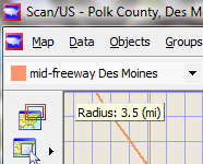
Radius readout in 'group by radius' mode
Another note about group mode: The current group is displayed in the group dropdown just beneath the map menu. This is the group to which you will add objects when you draw your circle. If you make a mistake, the "group undo" button (red arrow below) will "undo" your group assignment.

Undo last group operation — red arrow button
The number underneath the "undo" button will show the number of objects in the current group. Make sure your yellow-colored second group - "Central Des Moines" - is the current group before you draw your radius, otherwise you will have to "undo".
Ready to group Microgrids
Click and drag to draw the circle of the grouping radius, and release the mouse. MicroGrids will be filled with the new group color:
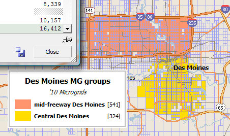
Grouping legend for new group
The grouping legend will appear. It shows the number of Microgrids (541 and 324 in the example above) in each group. If you notice you have made a spelling mistake, the best way to change it is to choose "Group Manager" from the Scan/US Groups menu at the top of the screen, and right-click on the group name in the Group Manager to get the "Rename group .." option
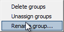
Rename group context menu
Then you can rename the group if you need to do so.
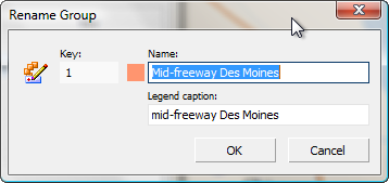
Rename Group box
But we digress. The main point of this example is to compare two groups in Quicklook.
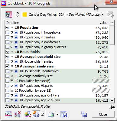
Quicklook showing group summary
Notice that Quicklook shows data item summaries for the yellow group, Central Des Moines - and that the number of groups in the grouping, [324], is carried along with the group caption in Quicklook's group selection dropdown. Click the dropdown (red circle below) to show all the existing groups and groupings on the layer:
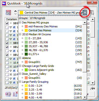
Quicklook Group dropdown
Probably no amount of explanation better illustrates the terminology of "group" and "grouping" than the image above. By clicking the group selection dropdown (red circle), you can select a group (shown with group colors on the left and object counts on the right) within a grouping (grouping names shown above are "Des Moines MG groups", "2010 Median HH Income," "Abilene," etc.)
Expand Quicklook (red circle below)
Now we expand Quicklook and show a series of comparisons. The comparison selection buttons (red rectangle below) determine whether you are comparing an object , a group, or a benchmark in the column on the right, to the current selected object or group in the column on the left. Here, the benchmark button — the third button within the red rectangle below — is pressed in, so we will select a benchmark. We are going to click through each one of these options in the examples below.
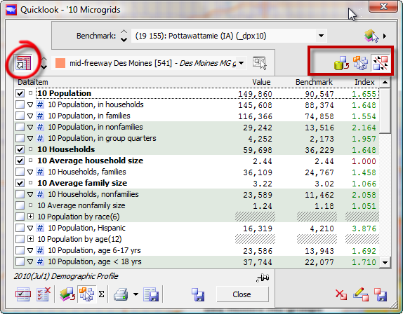
Quicklook comparison
You have clicked the "Show Benchmarks" button (red circle above) in Quicklook to get a Benchmark selection dropdown, and two more columns.
The Index column represents the Value divided by the Benchmark. Thus, the 2010 population in "mid-Freeway Des Moines" is 1.655 times greater than the population in Pottawattamie county. Since Pottawattamie County is way over on the other side of Iowa, this comparison is not too relevant. We can get different numbers by changing to the named benchmark we saved earlier, which we called "Polk County, Iowa, Des Moines."
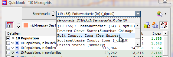
Benchmark selecting in Quicklook
You can do this and the comparison will appear.
Better yet, let's compare our group to the whole state of Iowa. We didn't save a benchmark for Iowa, but by changing comparison mode in Quicklook, we can look at any object on any layer.
Click Compare with Object (red circle below) and hit the "Select Benchmark Layer" button (green arrow) and choose States (other green arrow). You will see Alabama pop up in the benchmark dropdown:
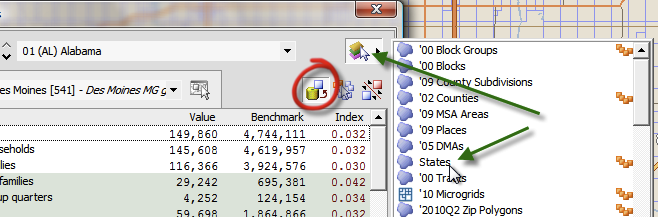
Expanded Quicklook compare with benchmark, showing benchmark selection menu
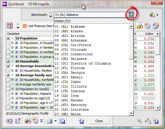
With States as the Benchmark layer, click the selector dropdown (red circle below) and choose Iowa from the list.
Quicklook select a different benchmark to compare
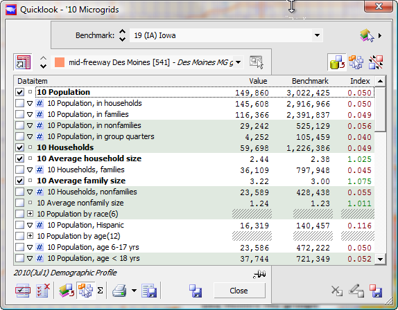
Your mid-Freeway Des Moines to all-of-Iowa comparison is displayed.
Comparing Iowa to a local MicroGrid group
Now, having compared to Iowa, let's compare group-to-group. Click the "Compare with groups" button (red circle, below) and if necessary, click the groups dropdown (other red circle) so your second group is shown.
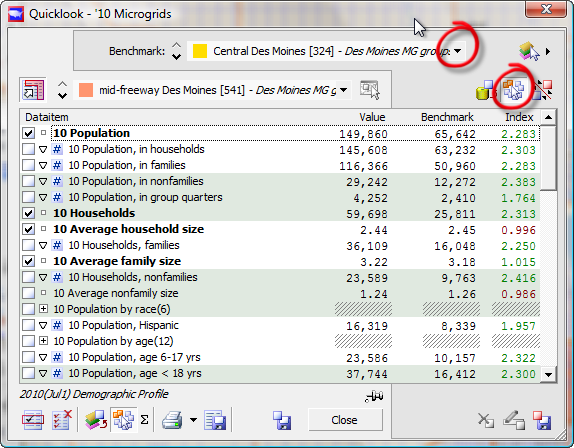
Quicklook showing group-to-group comparison
Now that you have your group comparison, of course you can export data for the comparison, or print a Quicklook Report for the comparison, which you have already learned how to do earlier in this sequence. In addition, you can save the group benchmark as a named benchmark to select and compare against later, without the need to reduplicate all your step by step group creation all over again.
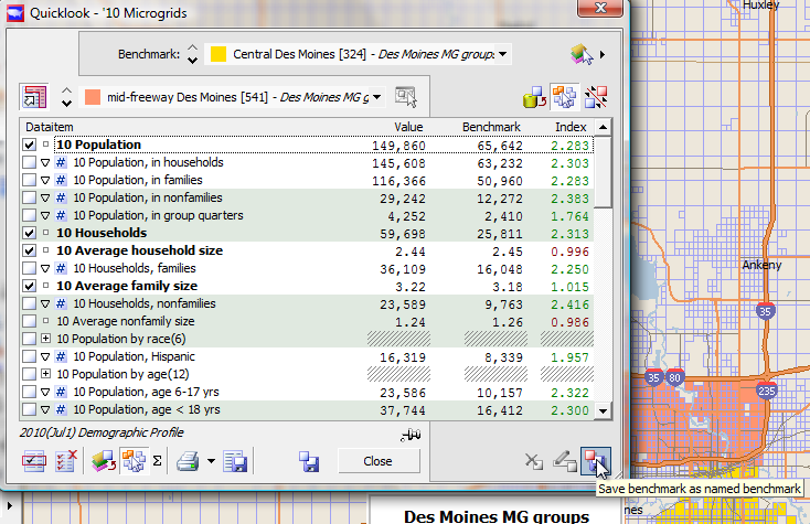
Pressing "Save benchmark" (lower right of Quicklook)
To save it as a benchmark, click the "Save benchmark as named benchmark" button in the lower right-hand corner of expanded Quicklook.
Quicklook Save Benchmark
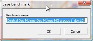
You will get the "Save Benchmark" dialog, which gives you an opportunity to rename the benchmark to something more memorable. It is pretty descriptive as-is, however, so let's just leave it like that.
Now, with a named benchmark saved from a MicroGrid group based area, let's see how to compare that area (a group of MicroGrids) to a five-mile radius around a nearby town to the north: Ames, Iowa which is home to the University of Iowa. To do this, we need to make a five-mile ring centered on Ames. The demographic numbers will be in the ring without any additional effort on your part. We can just compare.
First, change to "Edit Objects mode". Click the Edit menu on the left, just above the zoom slider, and click Edit areas.
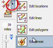
Edit Objects mode menu: choose Edit Areas
When you do this, a "Create Layer - Areas" dialog appears. Make two changes to what you see: the new layer name and the ring area radius (red circle below).
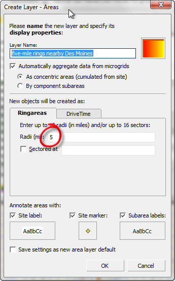
Create Layer areas
First, change the name so that it reads "five-mile rings near Des Moines".
Second, replace the list of radii in the Ringareas tab with just one: five miles.
Scan/US will create more than one ring area, or if you click DriveTime will create a drivetime polygon based on minutes of driving time, but let's just keep things simple for this example.
Now, the thing to bear in mind is this: after you click "OK", the next place you click in the map, it will create a five-mile ring at that point. But Ames is well to the north of our current map of Des Moines.
Fortunately, you can scroll the map by clicking near the edge, and not creating a ring until we get to Ames.
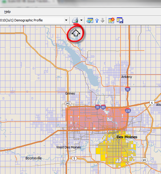
Scroll map up by moving cursor to top
Move your cursor near the top edge of the map, until you see an arrow appear next to the edge (red circle). Click your mouse to scroll the map upwards
 . When you get to Ames, click on the point in the map where you want to center the five-mile ring.
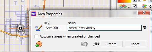
Area Properties will pop up, and you can name the area "Ames Iowa Vicinity", as above, and click "Create." You will get a map that looks something like this:
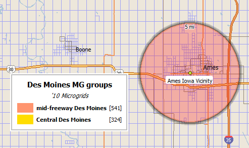
Ames Iowa 5-mile radius
Notice that the MicroGrid groups legend still shows the values for your two groups, even though they may have scrolled off the bottom of your map.
Ok, now with your ring on the map, it's important to keep in mind that you are still in "Edit Objects" mode, and if you click again on the map it will create another new object! Don't do this. Instead, change back to "Select Object mode"
Choose the ring from the objects at that location.
Now, when you click on the ring, it will give you the opportunity to select it, or any other object.
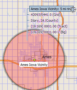
Choosing the 5-mile ring from the object selection menu
And if you select the ring, you will be able to see your comparison in Quicklook.
Note:
The two icons in the lower right of Quicklook are a pencil button, which you can click to rename a benchmark, and a red-X button that you can use to delete a named benchmark.
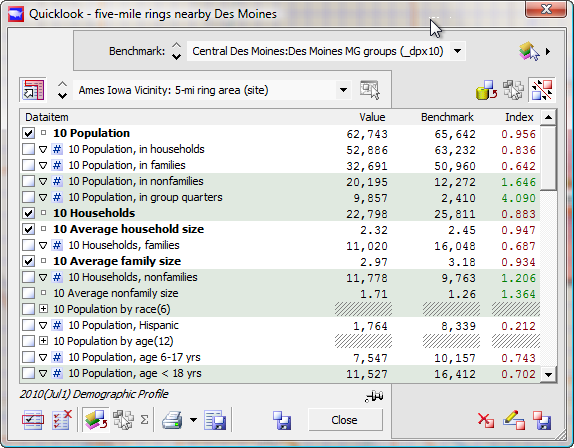
Microgrid group compared to five-mile ring
As you can see, a principal difference between these two populations is the Hispanic population, which in Ames is about a fifth of the area we are comparing in Des Moines. Do you wonder what the percentage is?
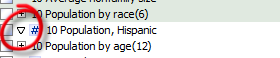
Click triangle to show percentage view
You can click the triangle next to the "#" sign on the Hispanic pop line, and it will expand to show the percentage, like this:
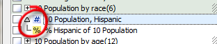
Hispanic population count, and percentage
Similarly, you can collapse that variable, and show only the count if you do not wish to see the percent.
The "plus" signs to the left of Population by age(12) and Population by race(6), are "array variables" which can be expanded to show more information about the number of people in race categories and age ranges in the two areas.
In conclusion
That is our comparison of Central Des Moines, to an area centered on Ames, Iowa with a five-mile radius. And that is how you can compare any object or group to any other object, group, or saved benchmark, on any geographic layer, anywhere in the United States, without writing any query code or loading any data tables, or any other complicated procedure.
All you have to do is select the layer, the object, and the comparison layer.
You can export all or just a few of the data items to Excel, or print a report to your printer or PDF file to send as an email attachment.
* * *